Amir Mohamadzadeh
When Rosewood Blooms
When we started in 2013, all we had was $1,500 and an idea. It was simple – leverage social media for brands in ways nobody had experienced before. We thought, what would it look like if we turned brands into humans on social? They could have personality, make friends, share opinions and tell stories. What if a brand could tell stories every day rather than once per year? What if we used social to find a new wave of creative people and hire them? What if we paired them with in-house content creators to make content within a matter of hours? What if social became the most powerful network and communication tool on the planet? Our hearts and minds pushed further every day.
We believed in this potential reality, but most others back in 2013 did not. So the challenge quickly became, how could we convince brands to trust in this vision and pay us to experiment with it? Matt and I were in our mid-20s, and the ex-Nike employee thing could only go so far. Well, first, we’d have to call ourselves a social media creative agency. And come up with a name.
Our approach, ideas, and content were thoughtful, strategic, and premium. We searched deep for a name to represent this.
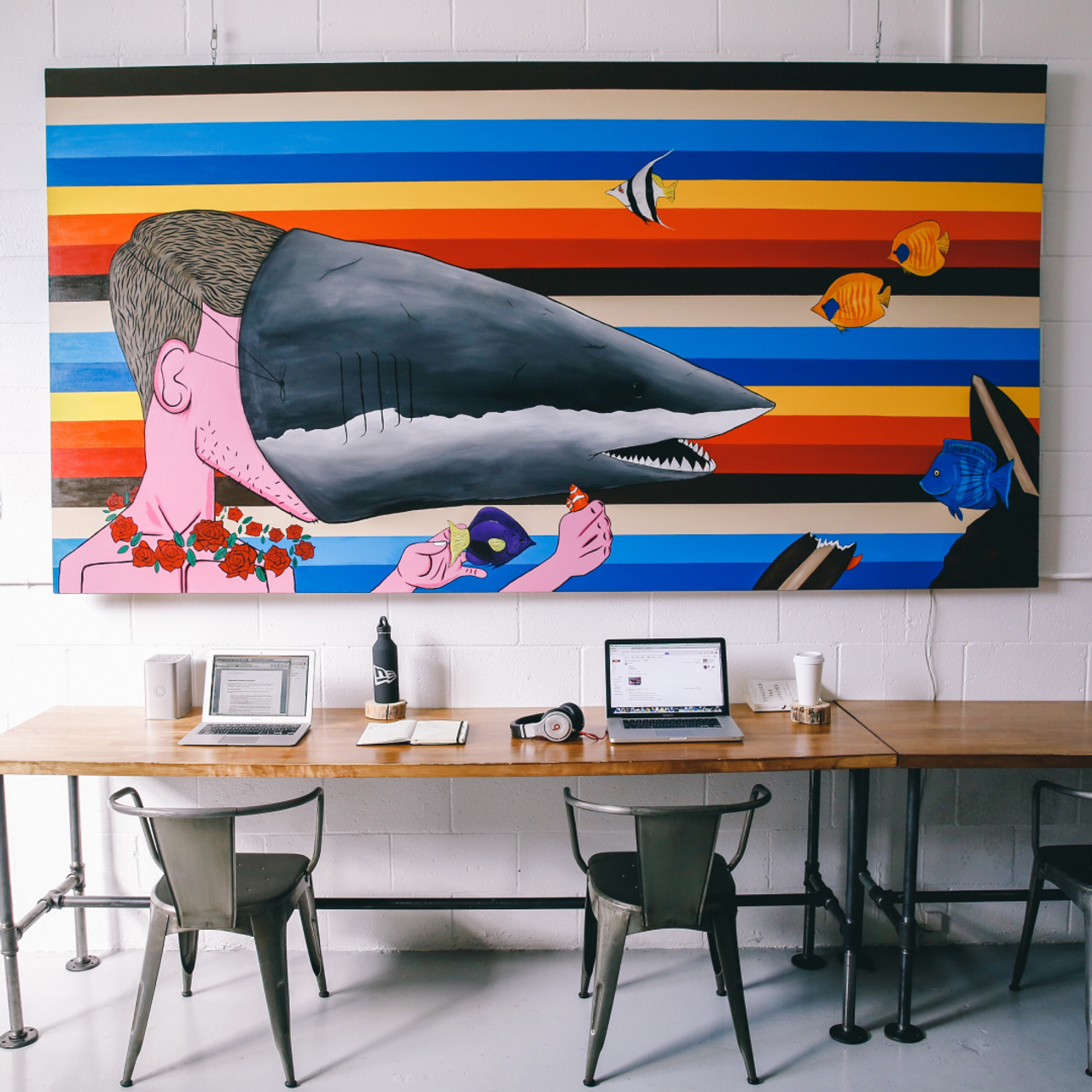
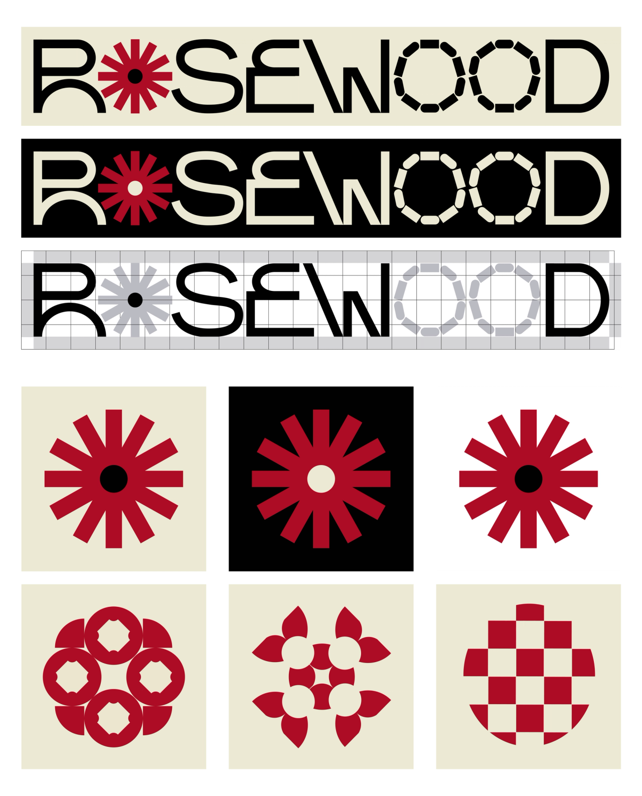
While most brands at that time gave social to their interns, we were on the complete other side of the spectrum. Our approach, ideas, and content were thoughtful, strategic, and premium. We searched deep for a name to represent this. Rosewood. Considered the finest hardwood, premium in quality, sweet in smell – and used to make ancient chess sets for the Persian royal families – wisdom shared with me by maman bozorg (or, “grandmother” in Farsi). Chess being a game of strategy and rosewood as a premium substance? It worked perfectly. A clean, simple, bold, black and white brand identity would make us feel more official and established, especially when pitching some of our early clients like Toyota and Sony Pictures.
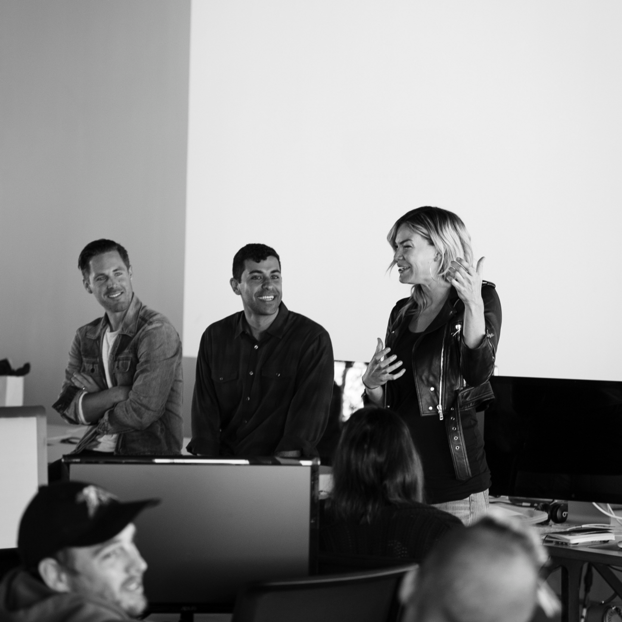
Defining best-in-class social. Building the plane as we flew it. Failing on lots of stuff, succeeding at others. Pushing ourselves too hard, then burning out. Making a commitment to do better for our team. Growing in capabilities and maturity. Hiring smarter people than ourselves. All the while keeping the blinders on – focused and unfazed by competition and publicity. Always sharpening our craft as each new social platform and creative opportunity emerged.
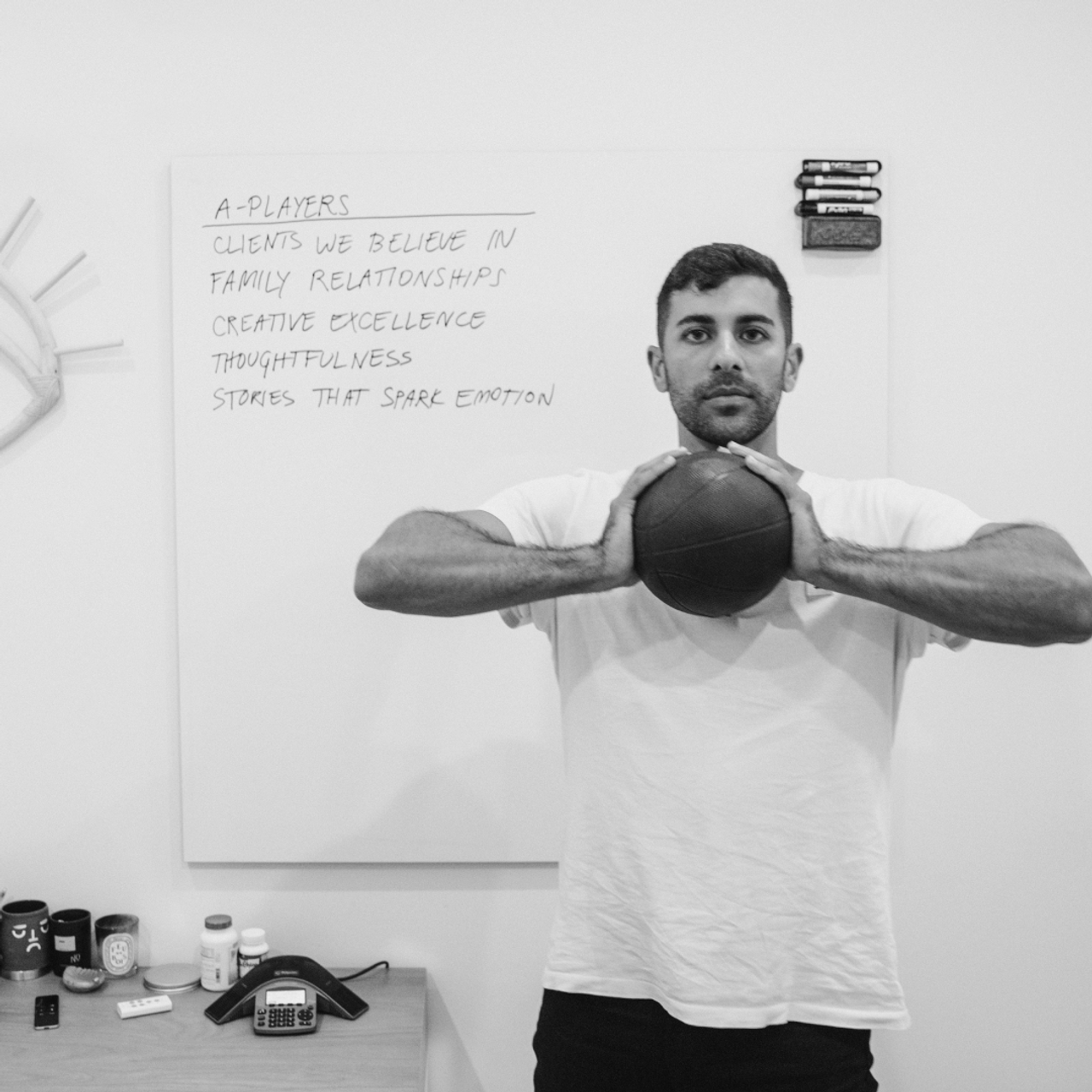
About nine months ago, we looked up. We looked at our purpose, our values, our work, our team, and our brand. It quickly sank in – though our DNA has largely stayed the same, three key traits evolved. First, our ideas are far more experimental, diverse, and expressive than ever before. Second, the intention behind our creative is more purposeful and valuable to people’s lives than ever before. Value entertainment > Mindless entertainment as we like to say. Third, even though we’ve grown from two people in a garage to 80+ people nationwide, our aptitude for change and desire for progress is stronger than ever before.
With every new brief, every new teammate, every failure and every success, we evolved. And after nine years of evolution and the emergence of these three strong traits, we realized that a brand refresh was long overdue.
One of the many characteristics that fascinated me about Virgil was his ability to transform his language of nuance into imagery. Subtle changes that could change a person’s experience. He even worked on his own ‘dictionary’ to broaden the definitions of various terms and ideas collection after collection. One definition that jumped out came from SS20.
Flower: A wonder of nature. A naturally occurring metaphor for diversity, as beautiful on a micro level as they are on a macro level. A living creature that blooms from a simple seed, crosses borders, and blossoms come rain or shine.
Virgil Abloh
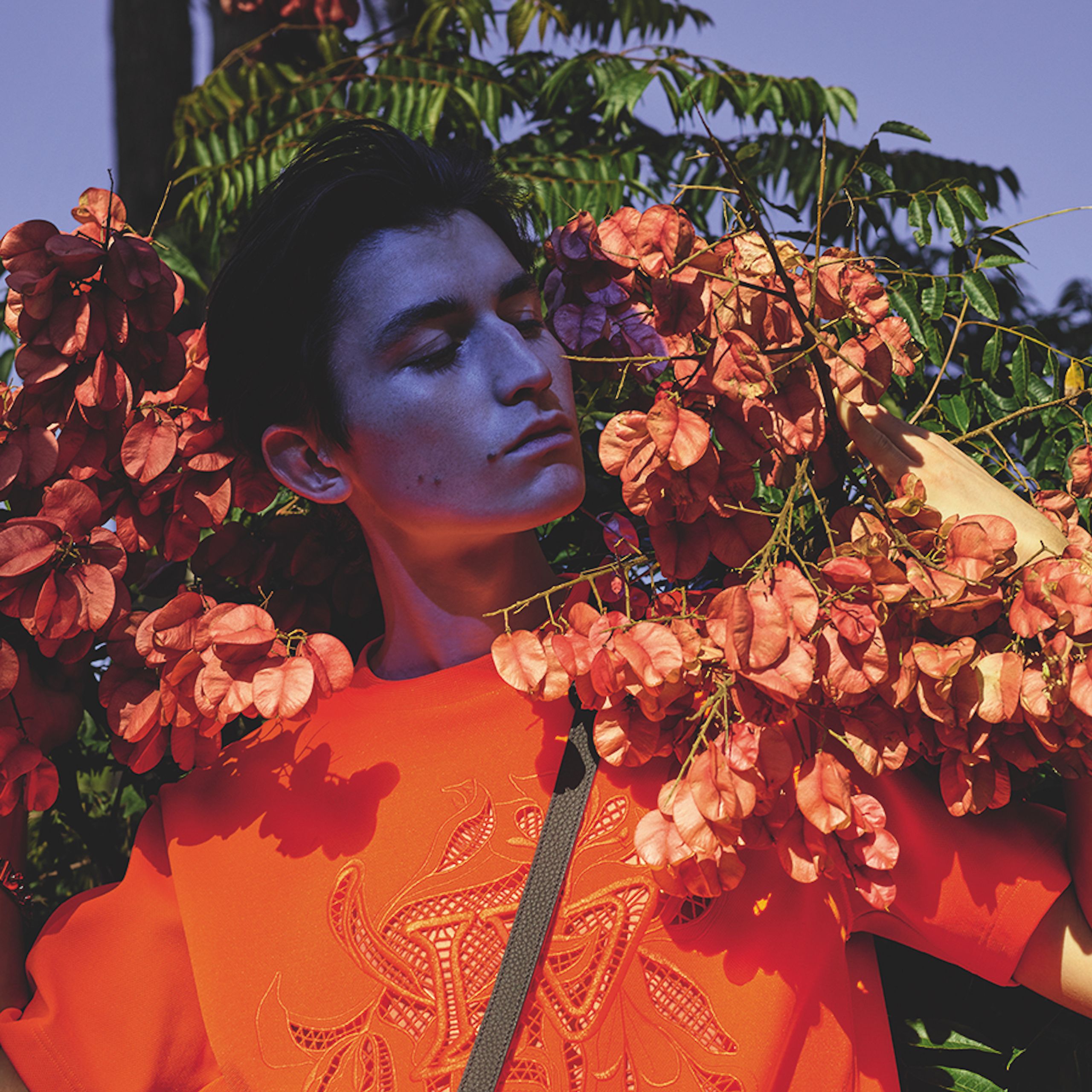
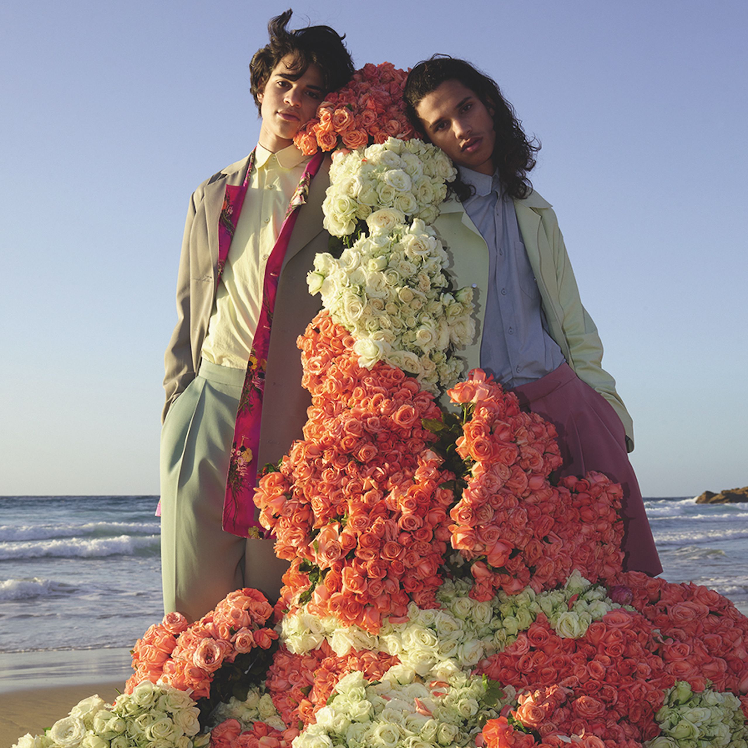
Our new identity is grounded in Virgil’s definition of a flower. We see flowers as a metaphor for our people: diverse in nature, nimble in approach, and seeking growth.
In our logo, the floral icon symbolizes the unique creative wonder that blooms out of team effort and purposeful work. The dotted lines remind us to stay nimble, transcend the norm and pursue change in the spirit of progress – just as a flower stretches across any border in search of sunlight necessary for growth.
Our color palette pays tribute to our legacy through primary colors and experiments with expression via secondary colors.
On our homepage, you’ll find yourself on a living flower wall, free to roam around and smell the roses on a micro or macro level.

As we creatively resurge, consider this our ongoing commitment: as an organization within the creative industry, creating work that is viewed by millions of people around the world, we commit to inclusivity, diversity, and individuality. We are responsible for the inception of ideas that can influence human behavior and we will ensure those ideas are developed by a range of humans with diverse backgrounds, experiences, languages, and upbringings. This is our invitation to our employees and clients, current and future - we ask that you join us as you are, to challenge the status quo, and work together to create stories backed by intention, awareness, and determination.
If you made it this far, thank you for your time.
Amir